Home Designs you Should Avoid
It's time for renovation. What should you do this time for your home? Add some new decorations, change the colours, get some new furniture. It's all very natural, but there are some very annoying trends that would make your home not very cosy, and nobody will actually like it. In fact it will make you look like a douche (a word to describe an individual who has shown themselves to e very brainless in one way or another).

So, what home designs should you avoid? Let's start with something that used to be cool in the 18th century. It still might be cool in some rich aristocrat's home, but that doesn't make it okay. I am talking about taxidermy. If you don't know what that is – you know those heads (trophies) of dead animals hanging from some wall. That is taxidermy. I really doubt that someone will find it extremely fancy, but just to say it – it's not cool, dead animals are not awesome. A bear rug is also not a good choice, even if it feels good on your feet. It just doesn't make you look like a good person, that's all.
Open layouts. They might look very nice in a way – more space, more light coming from different angles. But do you really thing it's practical? You have one room... One Room. Your bedroom and kitchen, and dining area, and living room are at the same place. Unless you are a student and this is your temporary rental apartment, don't do it. I mean, the only other room is the toilet. Why don't you put that in the main room, too? It's cool, but not that cool.
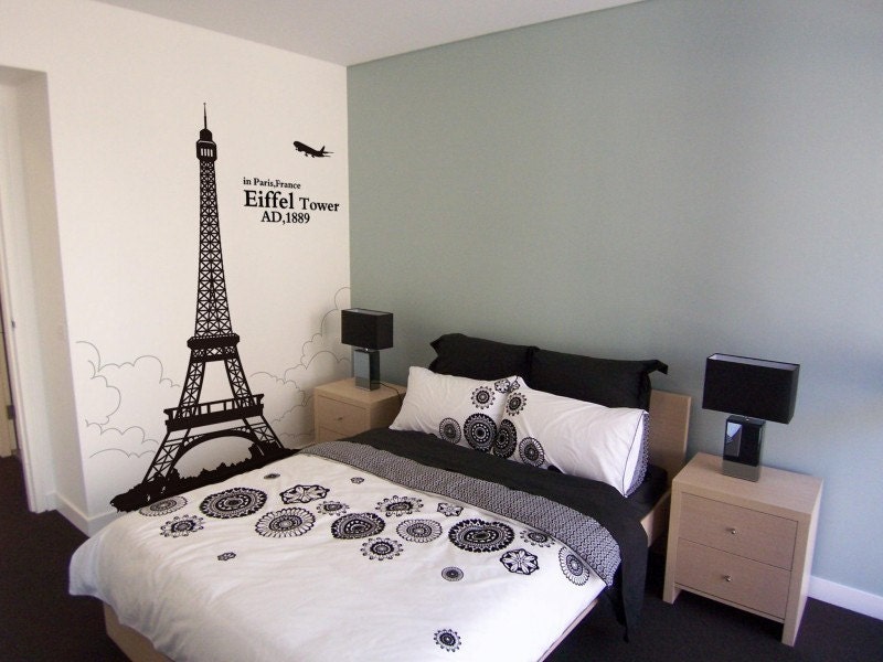
Clichéd styling. So you are a big fan of France. You want to make your home to look something like Paris. You will put a few fake souvenirs of the Eiffel Tower, some French art on the walls, some blue and white stripes on the floor. Do you really think this will make you look good? You are a douche – by far. You can't say the opposite. Probably your next idea will be something Spanish or Oriental...
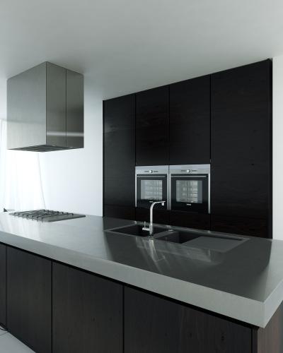
Chrome, chrome everywhere. Alright, this is a little bit better, but chrome is the colour of the douche (gold too). Your oven, your counter top, your microwave, everything is chrome. It might bring some style to your kitchen, but that doesn't mean it's really stylish. It's old fashion, but not that old to call it retro. And it is kind of hard to clean, so it's not even practical.
Lame signs – another rubbish styling. Do you really need them? Do you need a big sign on your book shelves, saying “books”. Or on your kitchen table – eat, drink. It looks stupid and it's ugly. I've seen many like these.

Food decorations. These are always a bad choice. You have a bowl or a basket of tasty, healthy fruits, but instead of eating them, you are just leaving them there on the table, to look pretty. And you are going to throw them away when they start rotting. Some people even buy plastic fruits. That's pushing it a little too far. It's all right to have a bowl of fruits, but please eat it. They are for eating, because they have a lot of vitamins and are good for your health, not for home decorations.
And after all these home decorations, what are you going to do with the mess you've made? Are you going to put it in bags and wait for someone to pick it up? Do it right – call a waste removal London based company. It will be the better choice.



Comments