Understanding the Basics of Responsive Web Design
Summary -
In today's fast-paced digital world, mobile responsiveness isn't just a buzzword—it's a game-changer. Imagine a website that adapts flawlessly to any screen size, providing users with a smooth and enjoyable browsing experience whether on a smartphone, tablet, or desktop. That's where Shades of Media steps in, setting the gold standard as a top-notch service provider in mobile optimization. With their cutting-edge solutions, they empower businesses to stay ahead of their peers, ensuring that their website is visually appealing and highly functional across all devices. So, if you want to elevate your website's performance and reach a broader audience, Shades of Media is the go-to expert you need!
If you're reading this, you're likely doing it on your mobile or tablet device. Mobile browsing is here to stay. While an expert mobile developer does not need a device-friendly website, you should consider mobile users when designing or redesigning your website. This ultimately improves the user experience and engagement of any user on your website. There's a reason why mobile-first website design USA has gained popularity in the last few years.
Let's take a glimpse at what responsive web design means.
Responsive website design is a common approach where we design the website in such an orientation that it fits all the screen sizes of desktop, mobile, and tablet. So, as the user switches from Desktop to Tablet or mobile, the website automatically adjusts the images, text, and other elements to the user's screen size. In layperson's language, the website should have a technology that can adapt to any screen automatically without building different designs for different screens and gadgets.
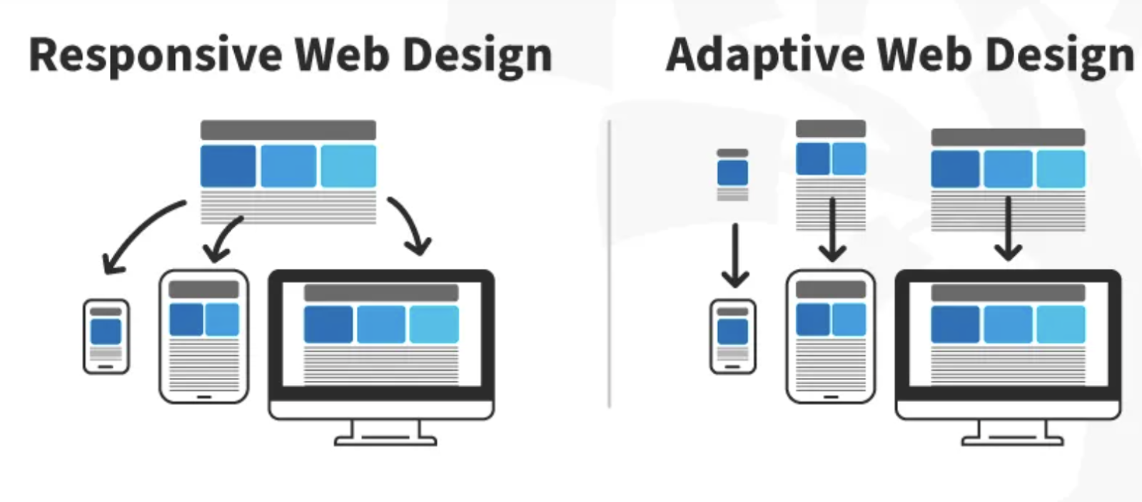
Responsive Web Design vs Adaptive Design
The main difference between the 2 is that Responsive designs adapt to the single website version in different screen formats. On the other hand, adaptive design delivers several different versions of the same page.
Web admins use these tools, but the approach is different for both of them.
Why Responsive Design Matters?
The answer to the above question is very simple: More than 51% of the traffic on any website is through mobile devices. In simple language, approximately 51% of people use mobile devices to do searches on Google. Mobile traffic has tremendously overtaken desktop traffic.
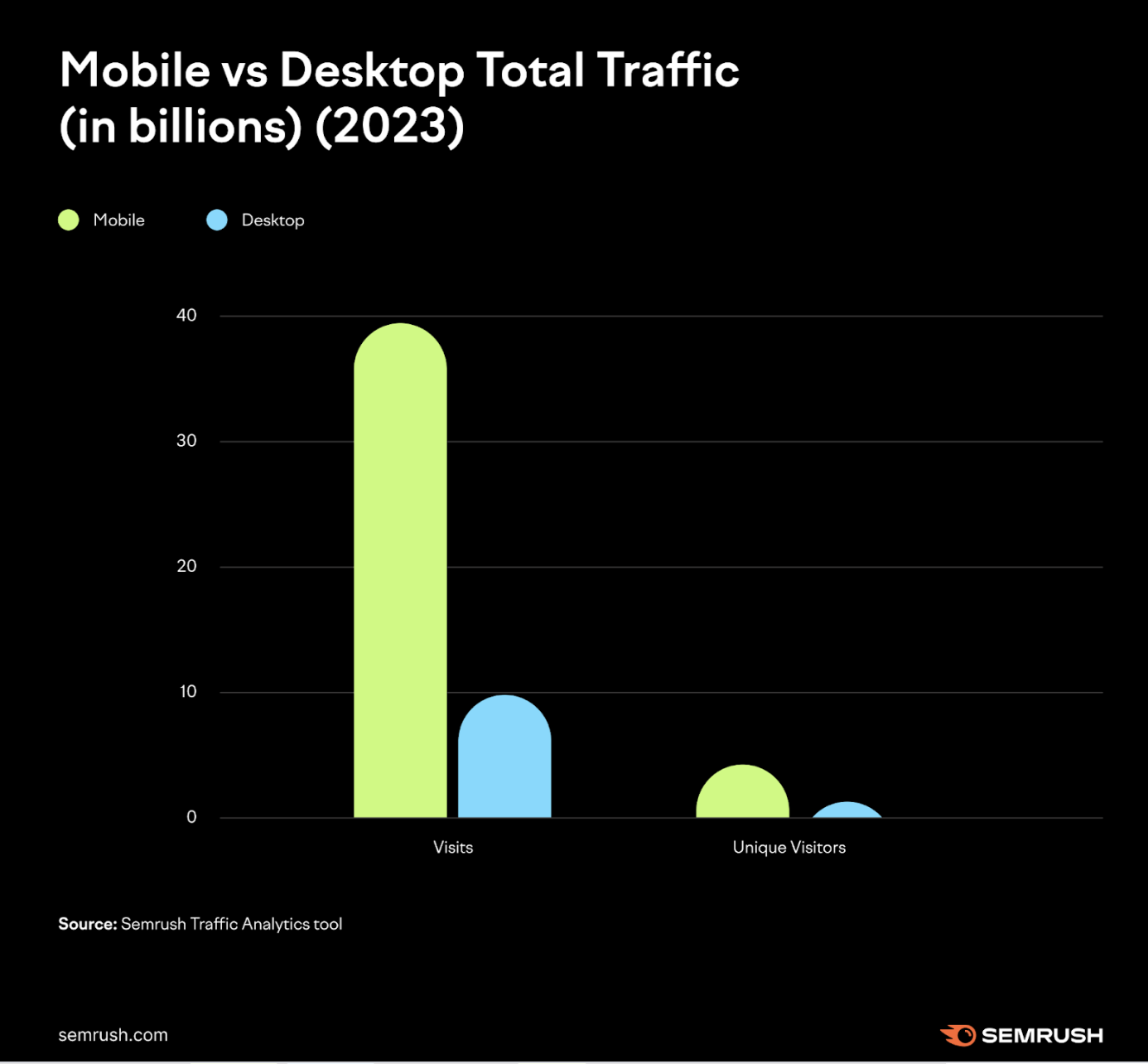
The latest study conducted by SEMRUSH in the article analyzed the 100 most visited websites in the US; refer to the screenshot above.
Therefore, when most users access your website through mobile, you can't just serve them a page designed for desktops. It will ultimately lead to a bad user experience.
The basics of responsive Web Design
Now, we will discuss the basics and skills required to build a responsive website.
HTML and CSS -
HTML and CSS are the core fundamentals of the pillar of a responsive web design. The two elements control any website's images, content, and elements.
HTML controls the main structure and elements of the page, and CSS is used to edit and modify the layout and other elements on the page.
Media query -
Media query is an essential part of CSS3 that enables the content to be adaptive to any screen size and resolution.
Responsive images -
Responsive images are another essential factor to consider when discussing website responsiveness. The primary goal of responsiveness is to set up height and width.


Comments (1)
S. R. G.
1
Executive
Great article. I heard there are now better software available for web development than HTML5 and CSS. Is that true?