Responsive Web Design is the right choice for your mobile SEO website

The adoption of tablets and smart phones are rapidly increasing and so the need of mobile friendly websites is on increasing. SEO may be your core component of your digital marketing strategy but having mobile friendly websites is becoming essential. 67% of users prefer to purchase from mobile friendly website and the companies depending on SEO for the online business are wisely taking the transition to mobile friendly websites and especially responsive web design.
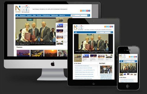
Responsive Web Design is designing a website having single URL and same HTML which get optimized across various ranges of devices from desktop computers to smart mobile phones, Phablet, Tablet etc. offering the optimal viewing experience, easy to navigate and read with minimum of resizing, scrolling and panning. India Internet, an ISO 9001:2008 certified company is a leading Website Development Company in Delhi NCR, having expertise designers and web developers. They offer quality, cost effective Responsive Web Design Services in India and other countries globally as per client’s requirement.
It is highly debated that whether to choose a separate mobile site or responsive design website. Both these options have their own sportive and negative effects. The best option for a business depends on various factors such as whether SEO dependent, the purpose of the website, and the expected target audience. If SEO is a factor for your website, then responsive web design is the best option because of these three reasons.
1. Recommended by search engine giant Google: Google with its 67% search market share states that responsive web design is the preferred and recommended mobile configuration and it refers that responsive web design is the best practice.

The responsive design websites have one URL and same HTML, whatever may be the device makes it convenient for Google search engine to index, crawl and organize the page content. If it is a separate mobile site then it has different URL and different HTML expecting Google to crawl and index different versions of the same site. Moreover, the content that lives on one site, one URL is easier for the users to interact, share and link to when comparing to content that lives on a separate mobile website.
2. One Website for many devices: The most attractive and appealing feature of responsive web design is its excellent user-experience across many screen sizes and devices. A site that works perfectly regardless of these different variables provides a user the most consistent and the best user-experience than a separate mobile website that is developed for particular device and screen.
3. Easier to Manage SEO: Having separate website for desktop and mobile require separate SEO campaigns. It is easy to manage one website and one SEO campaign than managing two websites and two SEO campaigns. This is the key advantage a responsive design website has over the separate mobile site.
The mobile specific SEO strategy is also having some benefits such as optimizing for keywords that a user is more likely to search when he / she is using the smart phone. However the mobile SEO strategy does not require a separate mobile website and mobile specific keywords can be incorporated into the responsive design website as well.
Google recommends Responsive Web design. It provides great user experience across various devices with different screen sizes. It is flexible cost effective and also easy to manage SEO strategy. For these great reasons, responsive web design is the right choice for your Mobile SEO website. If you are looking for quality mobile friendly web design services, then contact India Internet, a 13 year old Mobile Friendly Web Design Services Company in Delhi NCR offering responsive web design services globally to the client satisfaction.
Responsive Web Design is designing a website having single URL and same HTML which get optimized across various ranges of devices from desktop computers to smart mobile phones, Phablet, Tablet etc. offering the optimal viewing experience, easy to navigate and read with minimum of resizing, scrolling and panning. India Internet, an ISO 9001:2008 certified company is a leading Website Development Company in Delhi NCR, having expertise designers and web developers. They offer quality, cost effective Responsive Web Design Services in India and other countries globally as per client’s requirement.
It is highly debated that whether to choose a separate mobile site or responsive design website. Both these options have their own sportive and negative effects. The best option for a business depends on various factors such as whether SEO dependent, the purpose of the website, and the expected target audience. If SEO is a factor for your website, then responsive web design is the best option because of these three reasons.
1. Recommended by search engine giant Google: Google with its 67% search market share states that responsive web design is the preferred and recommended mobile configuration and it refers that responsive web design is the best practice.
The responsive design websites have one URL and same HTML, whatever may be the device makes it convenient for Google search engine to index, crawl and organize the page content. If it is a separate mobile site then it has different URL and different HTML expecting Google to crawl and index different versions of the same site. Moreover, the content that lives on one site, one URL is easier for the users to interact, share and link to when comparing to content that lives on a separate mobile website.
2. One Website for many devices: The most attractive and appealing feature of responsive web design is its excellent user-experience across many screen sizes and devices. A site that works perfectly regardless of these different variables provides a user the most consistent and the best user-experience than a separate mobile website that is developed for particular device and screen.
3. Easier to Manage SEO: Having separate website for desktop and mobile require separate SEO campaigns. It is easy to manage one website and one SEO campaign than managing two websites and two SEO campaigns. This is the key advantage a responsive design website has over the separate mobile site.
The mobile specific SEO strategy is also having some benefits such as optimizing for keywords that a user is more likely to search when he / she is using the smart phone. However the mobile SEO strategy does not require a separate mobile website and mobile specific keywords can be incorporated into the responsive design website as well.
Google recommends Responsive Web design. It provides great user experience across various devices with different screen sizes. It is flexible cost effective and also easy to manage SEO strategy. For these great reasons, responsive web design is the right choice for your Mobile SEO website. If you are looking for quality mobile friendly web design services, then contact India Internet, a 13 year old Mobile Friendly Web Design Services Company in Delhi NCR offering responsive web design services globally to the client satisfaction.


Comments