How To Evade Mobile App Designing Blunder?
 Steve jobs said,”A design is not what it looks like and what it feels like, it is how it works like.” Designing is not a rocket science, in fact, it's like a game of dart, you just need to hit the right target. A man is known by the design he keeps and being an app designer you don’t want to be indicated as the man with bad design. There is no magic spell which will magically dial back a mainstream design into a luring one. The magic is hidden in the brains, storm your mind and see the miracle happen.
It is very well said that “The details are not the details, they make the designs.” No one learns designing aptitude since birth, nor they need to indulge into a hardcore study to be a pro. An open mind and experience are all that is needed to be an app designing expert. Mobile UI designing is the core element to focus on as well. However, being an expert is across seven oceans, to begin with, you need to firstly cross the river of blunders. Let’s sail through the waves and tides of the app designing blunders to evade.
1)The first impression is the last impression
A catchy first impression is something that hits the users mind at first glance. Even while checking out a girl, smartness, intelligence, nature would be at the second stage, primarily her appearance will be something that attracts. The same concept applies with the app designing. A scanty first impression or difficulty in navigation or any confusing feature are red alerts app designer should maintain a safe distance to.
2)Font fantasy
To collaborate more information, app designers tend to keep the font smaller. Are ants your targeted users? No right, humans are. Hence, leave your font fantasy of smaller text and keep it big and bold. Big fonts will make your content easy to read and grasp for the end users. It's kind of obvious but what’s obvious becomes a big blunder on the part of application designers.
3)All black is hack
Black is cool and trendy and you would probably pick up all the weapons to beat me black and blue for denial of black color. Hold your horse's designers, all black that too on white impacts the eye and make it troublesome to focus on the main text. Instead, go for almost black, yes there is a difference between all black and almost black.
4)Less is better than mess
The urge of inserting all the information leads to making this common blunders. A cluttered and messy app design is a big off for any mobile app. “Less is a big yes whereas, a mess is a huge fess.” keep the information limited to enable users to have easy access to the app. Another aspect to pay heed on is alignment. If anything feels wonky or cluttered or messy, that means alignment is off. Alignment is considered as one of the simplest ways of fixing any mobile app. It will instantly make your app look 10 times better. Being a mobile application development company, it's under your obligation to check alignment and clutter.
5)Convenient design for fingers
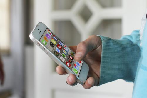
One of the pro app designing tips is that the target must be kept big so that users can have soft and easy touch. Quite a few apps fall in the pitfalls of keeping smaller touch targets which are difficult to hit compared to larger ones. Small touch target clamor more veracity and bulldoze the users to put up more whack in hitting the target. Users generally have the proneness to use finger pads instead of a finger and hence bigger touch target should be kept to comfort the user.


Comments